Print Terminology Explained
You want to effectively speak to your print vendor on the specifications of your newest project, but not sure how to communicate print terminology to them? How can your company help ease the process of receiving (and understanding) the estimate and how to develop the piece in the first place?
Let’s take a look at the popular terms to help your team learn how print vendors operate.
Print Type
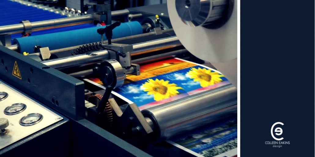
There are two different ways that a vendor can produce your materials – offset and digital printing. At a very high level, offset printing is great for large runs (i.e. 500+ copies) and digital will be more beneficial for short print runs (less than 500).
Offset printing is time consuming in its initial set up and more expensive than digital because it requires the use of metal plates with each plate holding only one color that is being used. The plates then transfer the color to the rollers that press the color on to the paper. Digital printing uses electrostatic rollers (also called “drums”) that apply the toner on to the paper. The drum, as in the offset process, only holds one color, but uses the static charge to apply the color to the sheet and fuse onto the paper in a quick and fast drying manner.
The other difference between the two is the sheet size that each press can handle before the final cut size. Offset usually runs presses of 29” and 40”, which allows for a larger selection of the types of print collateral than a digital press can provide as they typically only go up to 19”.
Color Process
The color process that used in printing is known as a 4-color process, CMYK. This ensures your multi-color designs or photographs for the different collateral pieces are printed as bright and clear as possible.
The four colors in CMYK are Cyan, Magenta, Yellow, and Black. The plates in the offset printing are filled with each color needed and as the sheet works through the press, the colors are applied in different layers which create the intended colors of the design.
As effective as the CMYK process can be, not every color can be produced by those four colors. That is when a Pantone (PMS or also known as Spot Color) is used. PMS colors have specific color formulas and assigned numbers that will be represented in print. PMS colors will be used in conjunction with the CMYK process and essentially add a color to the printing. So, it will be labeled as 5-color or 6-color process, pending the amount of PMS colors chosen. They do incur additional costs, so they are reserved for special projects.
Since PMS colors have a specific formula to the color combination, to avoid upcharges, the color can be converted to CMYK. It will save set-up costs from the print vendor. Whether using CMYK or PMS colors, it needs to be clearly stated in your artwork to avoid having the printer producing a result you were not anticipating.
When requesting an estimate or viewing the estimate, you will see the colors in shorthand. The options can be:
4/4 – four ink colors applied to the front and back of the piece. Colors are in CMYK.
4/1 – four CMYK colors applied to one side and other receives one color. Usually the one color will be black. PMS can be the one color, as well, and needs to be clearly stated in the design.
4/0 – four CMYK colors applied to one side only. Other side will not be printed on.
When seeing it listed as with a 2 (2/2, 2/1, 2/0), it tends to lean more towards the use of PMS colors with the possible use of black ink and needs to be clearly indicated in the design.
1/1 – means both sides will receive printing with one color only. Commonly, this will be used for the use of only black ink, but can be with PMS colors.
1/0 – one color on one side and other is completely blank. Indication on colors is crucial for printing items correctly.
Image Resolutions
High quality images are needed to ensure a sharp produced piece, with no fuzzy images. What needs to be submitted to the printer is an image that is at least 300 dpi. The amount of pixels in a picture is translated to become DPI, which stands for dots per inch – the more dots per inch, will allow for a high resolution image.
Page Setups
When your design team member submits artwork to the printer, the pages in the file will need to be setup correctly. If the vendor can submit a template at the very beginning to work off of, that will help alleviate any back and forth communication once files have been submitted.
Die line is another name for templates in how the piece needs to be designed and what areas are open to adding that content and design.
Inside the trim is where your designer should be creating the content and design of the template. This is where the paper will be cut to the final size of the piece.
Bleeds are an aspect of how a page and imagery is set up. The bleed is content that extends off the trimmed edge of the final piece. They are important because it allows the artwork to fill the page as intended. If there are no bleeds, the piece will show white margins where there is not supposed to be.
The folds of the print piece need to be taken in to consideration when designing and then finalizing the files for submission to the printer. Folds are in books, magazines, catalogs, or pamphlets and will affect how content and design are laid out for the user to easily read. Identifying the folds in the files will help guide the printer in the production of the pieces.
Special Effects
Different special effects to the design can help alleviate a piece that is very visually appealing.
Embossing is when the paper is raised to add a 3D effect. Debossing is just the opposite, when the paper is pushed down, creating an indentation. These can add single or multi-level dimensions to your piece and can be very custom, which will increase costs.
Die cutting is when you cut parts of your paper to add a specific design element. The die itself is a template and then die cutting, will be the act of cutting the paper in to that die.
Foil stamping is a way to enhance the finished piece of your design. Metallic foiling is more commonly used than matte and is often used for seals or awards to create a pop in the visuals.
Coating
Adding a coating to your piece will help add visual cues to your reader and increase durability to the finished product.
Aqueous coating is a clear, fast-drying water-based coating that is used to protect printed pieces. It can be done in a glossy or matte surface that lock in the quality of the paper and ink. Usually applied to the entire piece and not in specific spots and applied while the artwork is on the press.
Varnish is almost completely clear and can be done in matte, gloss, or satin finish. Varnish can be applied to the piece in its entirety or done as a spot varnish, which allows you to highlight specific aspects of the design. This is also applied while the artwork is on the press.
UV Coating is completed by exposing the piece to ultraviolet light to quickly dry and harden on the page. You will only find UV Coatings are finished with a gloss, which will be even shinier than other coatings. The finish can be quite hard and may allow the piece to crack when the paper is folded. This can be applied on or off the press and can be done in a spot fashion, which will allow the piece to highlight specific elements.
Soft touch coating creates more of a luxurious, velvet-like texture to the finished product. The paper becomes “soft” to the touch and adds a tactile appeal to the piece. Soft touch coating dries fast, is non-yellowing, eco-friendly, and it will also add a fingerprint resistance.
These are important factors that go in to creating a visual, printed masterpiece that appeal to the readers. Print may not be as widely used as it has been in previous years, but still adds a wonderful tactile experience for the end-user.
At Colleen Eakins Design, we can help guide you through choosing the right design elements for your finished piece.
Keepin’ The Lights On