The Most Recent Twitter Update: Your Thoughts?
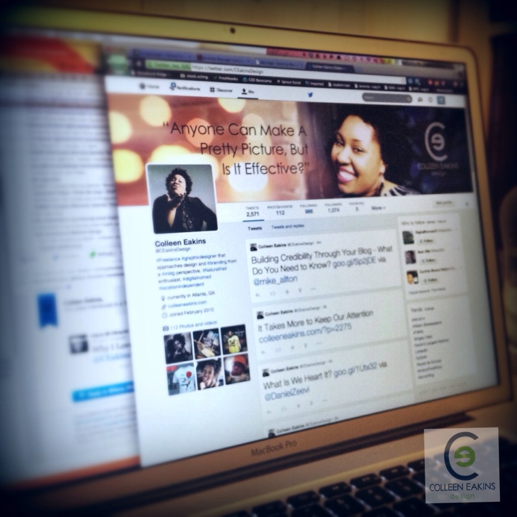
Today’s post is really more of a question, or a series of questions. Have you updated your Twitter profile to go along with the latest updates? How do you like the update? I updated my profile a couple of weeks ago, but I am not quite happy with the update that I made. I love the way it looks on my desktop, but I hate the way it looks in the ipad app. On my phone however, I love it again. No matter how I tweak it; I find I can’t seem to love it on all three devices. So, I chose to go with the majority and keep what I have now.
A while back, when I was changing the graphics on my YouTube channels (don’t look; they’re kind of neglected), I liked that YouTube showed me how it would look on mobile and TV in addition to the desktop. This made it so much easier to create graphics that would work visually for all devices. I wish Twitter would allow for a similar preview option or at least update their apps to work better with the desktop version.
Since I made my changes earlier in the roll out, there weren’t any templates or guides out yet to follow, created by users. So since I love lists and I don’t want you to be as frustrated as I was, here are a few templates you can download to help with your design:
Photoshop Template by Timothy Brand
Photoshop Template by Pauline Cabrera (includes her artwork as a guide)
Photoshop & PNG Template Files by Inline Vision (requires email list sign-up)

Colleen Eakins is a dynamic and creative individual that possess a knack for great design. With over 15 years of experience in the field of graphic design, Colleen is able to effectively brand her clients with great design pieces. Her motto is: “Anyone can make a pretty picture, but is it effective? Will it make your customer buy your product or use your services? My design tries to answer with a YES!”


